friends of the public garden
common knowledge
a common problem
Established in 1634 as the nation’s first public park, there may be no more iconic place in Boston than the Boston Common. Today, more than 14 million people visit each year—whether for concerts, protests, historical tours, or simply a quiet moment in the city’s “public living room.” Many of these visitors rely on the park’s wayfinding kiosks for directions and information, but while the park has evolved over the centuries, these kiosks were stuck firmly in the past.
As stewards of the Common, The Friends of the Public Garden partnered with Visual Dialogue to reimagine and modernize the kiosks. Our goal was simple: create clear, engaging maps and informational panels that reflect the Common’s rich past while serving visitors well into the future.
a fresh start
We began by developing an updated visual language to unify the panels. To maintain a connection to the park’s heritage, we paired a classic typeface inspired by original park signage with a clean, modern sans for improved legibility. A lighter color palette and simplified layouts give the kiosks a brighter, more welcoming look with improved readability. (Produced with a virtually indestructible Direct Embed process).
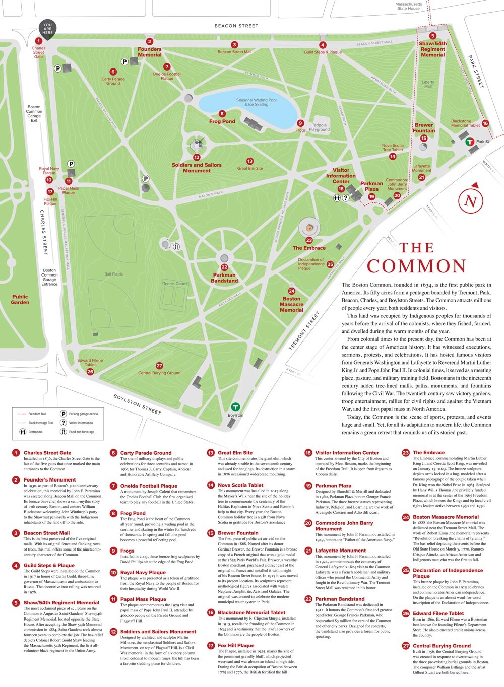
We updated the Boston Common map to feature contemporary attractions and monuments, including The Embrace, and clarified the park’s many points of interest. A new labeling system connects numbered sites on the map to descriptive text, encouraging self-guided exploration.
you are here
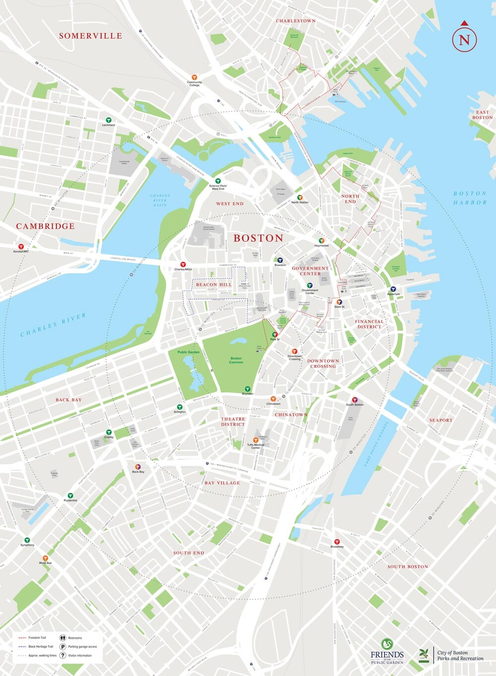
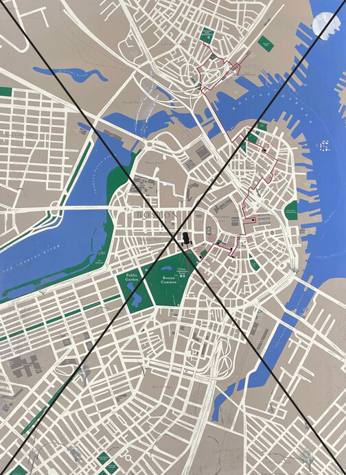
The city map was perhaps the most in need of attention. Its outdated, pre-Big Dig streetscape and missing landmarks made it feel like a relic. We redrew it from the ground up—introducing lighter tones, clear typography, modern styling, and highlighted T station labels. Walk-time radiuses show the Common at the heart of the city and help visitors orient themselves to explore beyond the park’s boundaries.
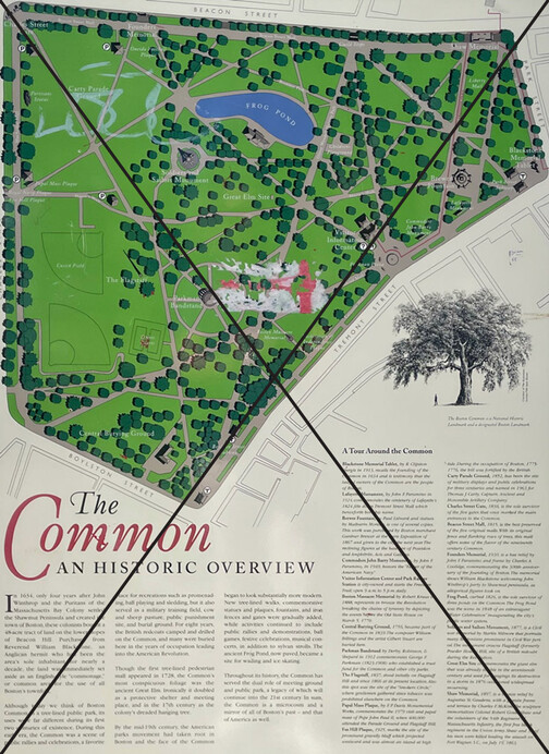
the past is present
Despite the abundance of fascinating stories in the park’s history, the previous panel presented them in a practically unreadable way. For the refreshed design, we curated a blend of archival and modern photography to convey a timeline of the Common’s evolution over nearly four centuries.
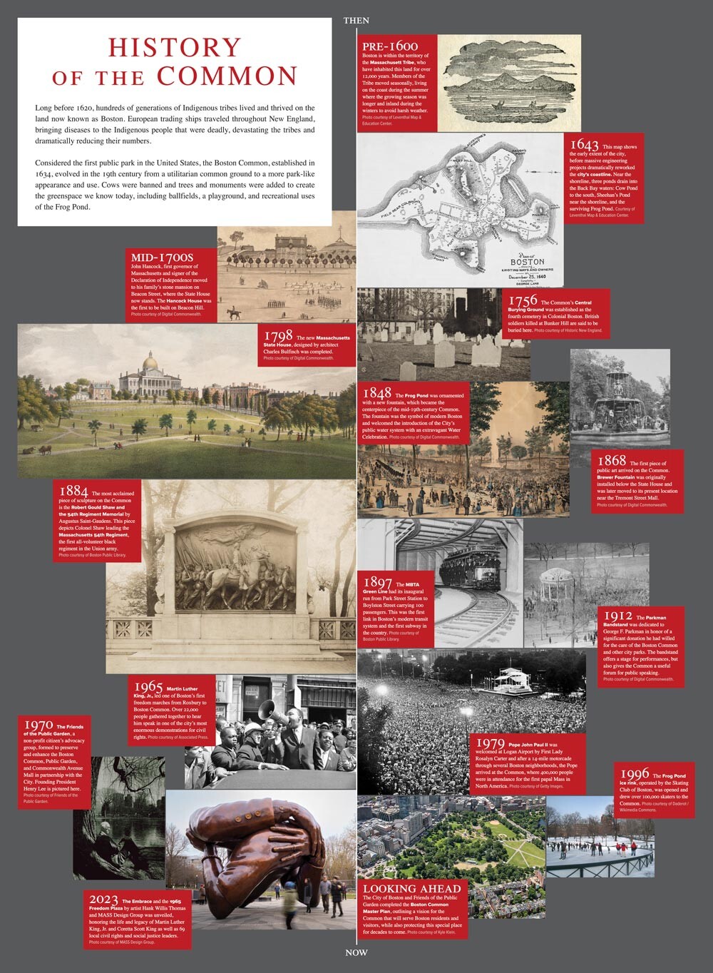
On the lower portion of each face of the kiosks, two side-by-side square panels presented an opportunity for additional imagery to engage viewers. With the team at The Friends, we selected pairings of images that would represent the Common “then and now.” The panels depict historic and contemporary views including the Frog Pond, protests, and monuments—showing the Common as a place of community, continuity, and change.
“Folks are thrilled! I think the signs read very clearly and both the thoughtful color selection and text/image/icon size contribute to that.”– Rebecca DiTommaso, Friends of the Public Garden Director of Capital Projects
If you find yourself strolling through the Common, keep an eye out for the new kiosks. Whether you’re a first-time visitor or a lifelong Bostonian, you just might uncover a story you’ve never heard about America’s first public park.